35+ Shoddy Public Space Designs That Should Have Stayed On The Drawing Board
We all love a good public place where we can just sit and chill out, or maybe get some work done in a cozy environment. Sadly, that’s not always the vibe these places give off. For whatever reason, some designers create something that puts us on edge and is so cringe-worthy, you can’t help but snap a pic. You know, to go home and show your parents that there are more messed up places than your bedroom that they are always complaining about.
But please, don’t blame the owners. Blame the designers of these places, who probably had a drink or two the night before they made the plans for these public places. So without further ado, here are some dumb public place solutions that the world has ever seen.
Is it a Clock or How to Find Waldo?
You know, when we learned how to read analog clocks, we never saw this setup in our textbooks. Just one look is enough to give us a headache. From the scattered tiles to the oddly-placed numbers on said tiles, we’re ready to just give up.
Imagine that your phone is dead and you need to check the time. Well, grab your glasses and prepare to play a game of “Where’s the arrow pointing?” By the time you’ve figured it out, you’ve likely already forgotten why you needed to know the time in the first place.
When Even the Wall Has Hair Loss Problems!
Now, this one is for the books. We’re pretty sure the designer for this feels very strongly about their hair loss and wants to share their insecurities with everyone. Or perhaps they wanted to give people an easy test to see if they have trichophobia.
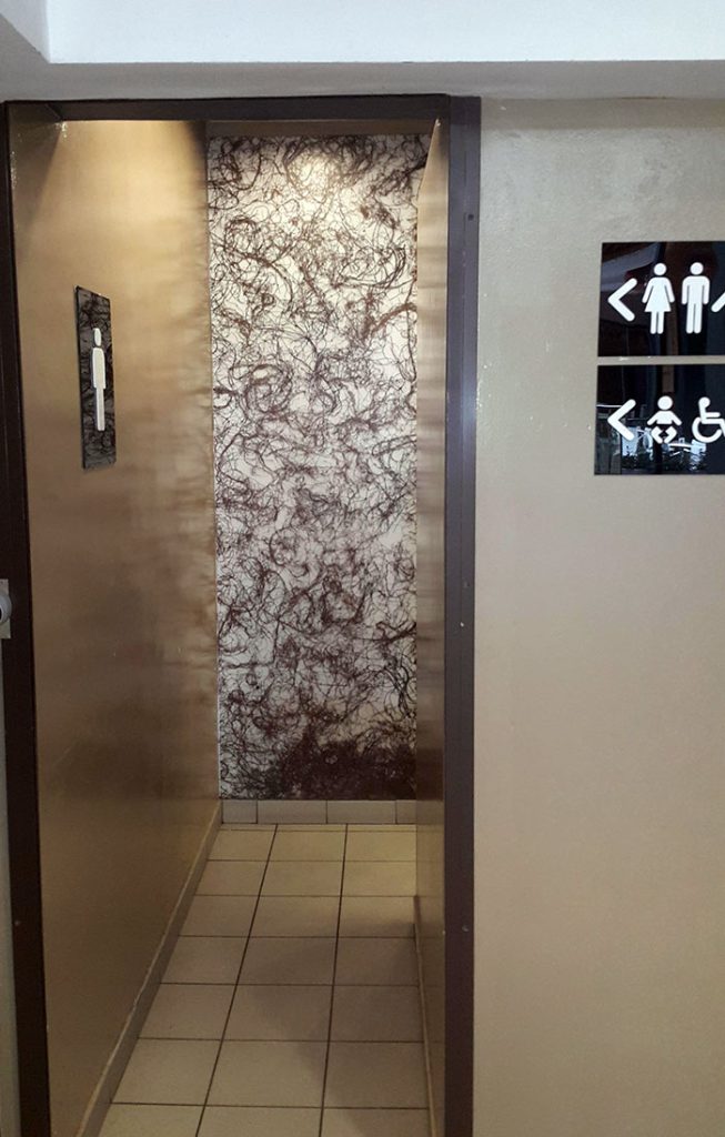
It looks like the floor of a hair salon. We wouldn’t be surprised if someone suddenly decided that, nope, they could “hold it until they got home” upon seeing this disastrous wall. We’d love to ask the designer just what they had in mind when they made this.
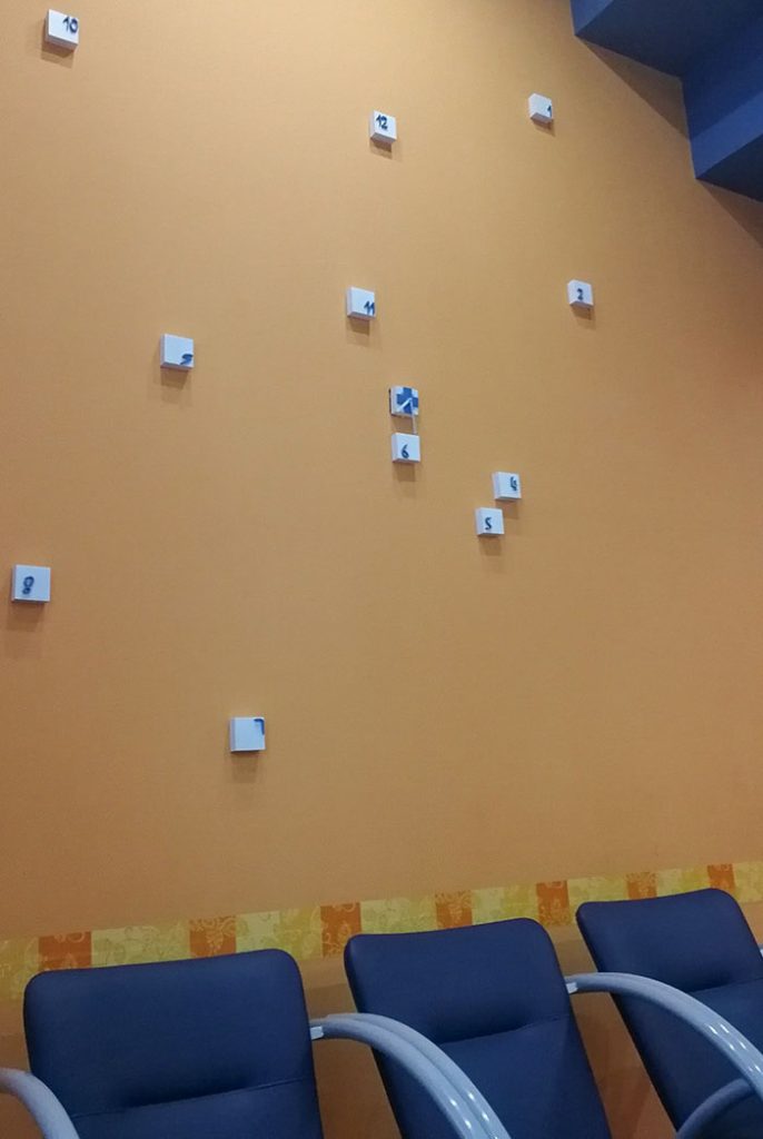
Can You See Me?
Waiting rooms are notoriously awkward places. Whether it’s empty or there are a few other patients waiting, we try everything in our power to avoid eye contact. To blend in, people usually rush to the first chair they find and settle in.
That’s just not an option in this office. It seems like the chairs in this office feel the same way and are trying really hard to blend in. This one is like a fun game where you get to sit on a chair only if you can find it.
Let’s Put On A Show
This one is a joke, right? Surely the designer didn’t think someone would want an audience when they’re going to the bathroom. They didn’t even bother to have the toilet facing away from the room! No, sir. It directly faces the audience so that they could see all the action.
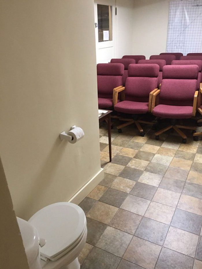
From the number of chairs, it looks like a meeting room. Maybe that’s the purpose? All we know is, good luck to the person who can’t hold their pee and this toilet is their only option! We sure hope their bladder doesn’t get stage fright.
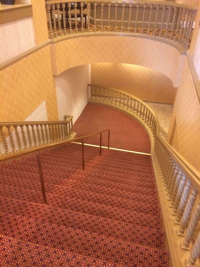
Trippy Goes The Stairs!
If we didn’t know any better, we’d assume that the image on the left is just a flat floor. After all, we’ve seen plenty of designs like that before. But one look at the image on the right and we’re thrown for a loop.
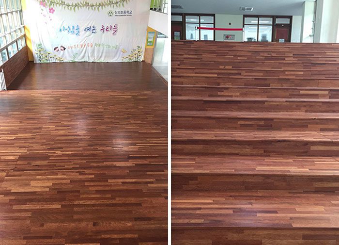
Yup, we were scared, too. Due to the design, it is very confusing to guess where one stair ends and the other begins. Worse yet, it’s hard to tell that it’s even a flight of stairs! Good going, designer. Get ready for some lawsuits on your hands.
Mind Twister, Anyone?
As bland as hotels can be, the designs are often carefully chosen to be both relaxing yet minimalistic and practical. But it seems like some people can’t settle for average and want to have every aspect stand out; like the hallway carpets.
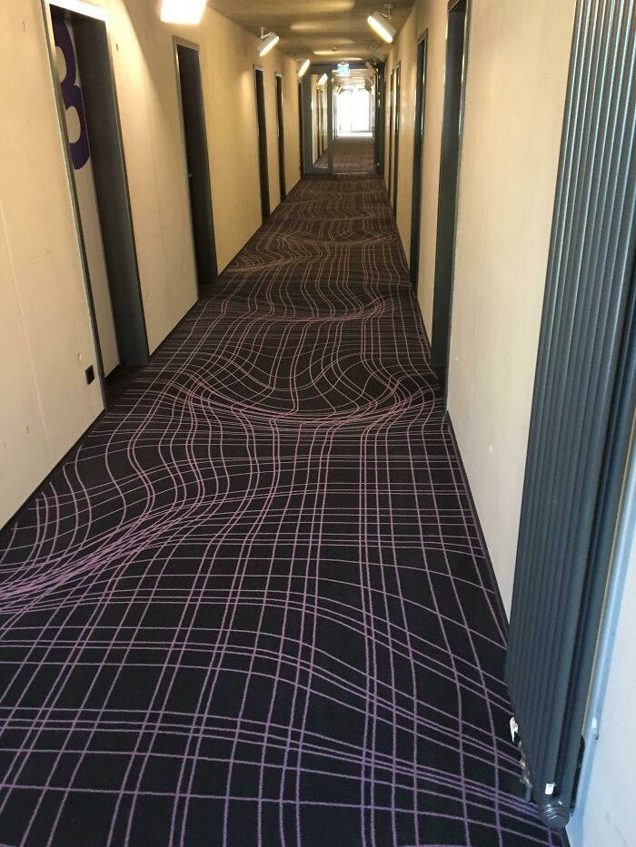
We feel bad for anyone stumbling in at 3 am after a long night out at the bar. On the bright side, it’s enough to make anyone feel tipsy without having a single drink. All in all, this is a design that should be used in an amusement park, not in a hotel corridor!
Escalator, Is That You?
Have you ever seen those videos where the parent tries to trick their child into drinking medicine by putting the medicine into a juice box? Well, it seems like the designer was inspired by those videos and tried to make a version for adults.
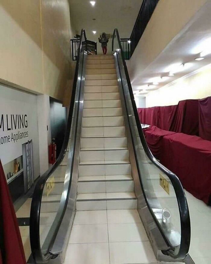
We can’t tell if they added escalator railings to the stairs, or if they didn’t have money to fix the escalator so they just converted it into a staircase. At least we know where Mitch Hedberg got his “the escalator is not stairs” joke.
The Peek-A-Boo Toilet
This designer thought that people might feel lonely when they have to go to the bathroom alone. How considerate of them! The kind designer, therefore, cut a wedge out of the stall door so that you can see your buddy waiting by the sink.
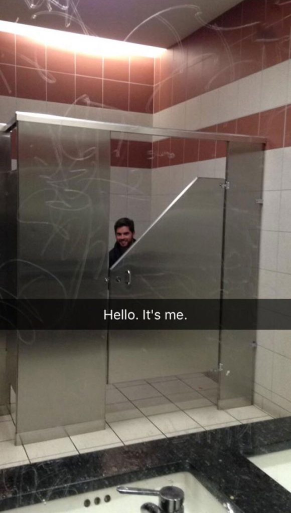
We feel bad for any introvert just trying to do their business. And for the record, guys, this isn’t why girls go in groups to the bathroom. This designer seems to wholeheartedly believe that “two’s company.” Siri, play Adele’s “Hello, It’s Me.”
Maze of Stairs
College is great and all, but when class ends, students should be allowed to turn off their brains and go chill with their friends for a bit. This campus seems to disagree as they made their staircases a complex puzzle.
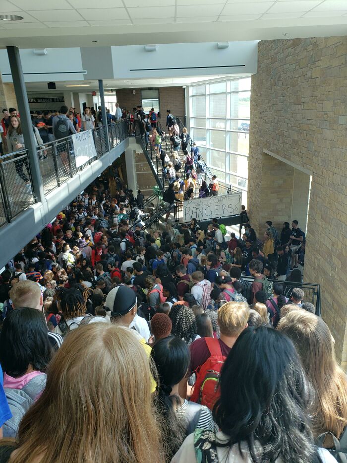
The crowd makes the building look like absolute chaos, but we wouldn’t want to visit when it’s empty. Somehow, an empty stairwell wouldn’t make us feel more at ease. This place is an accident waiting to happen, and the authorities should probably ask them to rectify this situation as soon as possible.
You Open, We Open, Right?
It is confusing as to what these windows were trying to achieve. Do they want the smoke to travel from one room to the other, or are they just feel the need to be close to one another, like Romeo and Juliet?
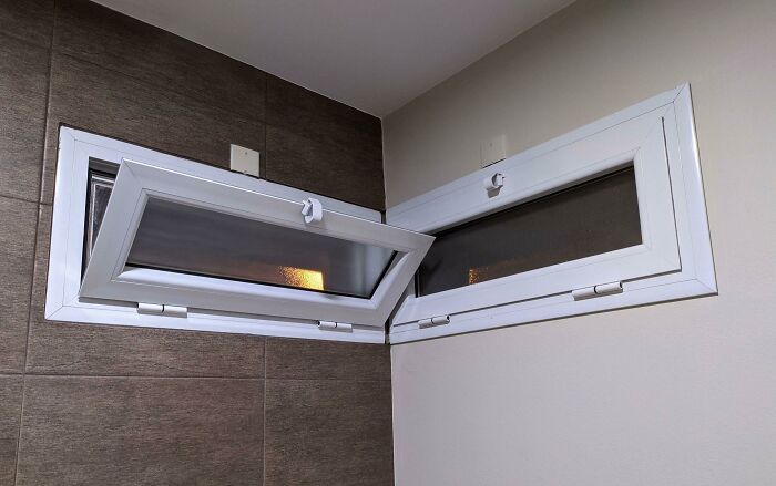
Well, whatever the purpose, we’re not sure the designer had any valid credentials. We’re no pros, but it doesn’t take a Master’s degree to know that you can’t have two functioning windows with this setup. We hope this person got a full refund!
Splashy Design
No, no, your eyes are not tricking you. That actually is what you think it is. Or is it? If you think the toilet seat looks like it has water all over it, you are right. But if you think that is actually water, then you are definitely wrong.
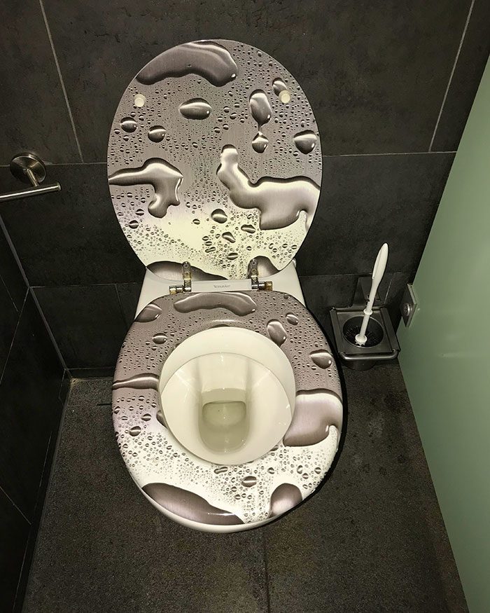
That, in fact, is the pattern of the toilet seat! Apparently, the designer didn’t want anyone to use this toilet. Otherwise, why would they have put on a toilet seat that repels people rather than makes them feel comfortable sitting down?
Don’t Look Up!
We know what the dress code for this restaurant is: trousers, skirts, or dresses. Usually, for a bougie place like this, women tend to wear a little black dress. But not anymore! If you don’t want some Peeping Tom checking you out, go for trousers.
If you’re determined to wear a dress, try a maxi dress, instead. Oh, and avoid dancing! Well, as far as stupidity goes, at least the people were kind enough to put out a warning for the ladies who decide to come here.
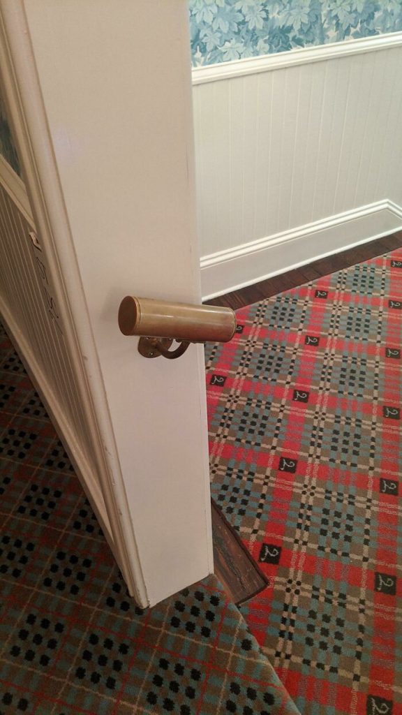
Where Are We Going?
This designer was probably going through an existential crisis and wondering where they were heading in life. And, sadly, the little voice in their head answered back that they’re going nowhere. As they say, art imitates life, and it certainly has done so here.
Instead of building a doorframe or directing the stairs elsewhere, this person decided to direct patrons straight into a wall. Now, if you are athletic enough to jump over the railing, go for it. But sadly, all you are going to find is a big, sturdy wall in front of you that leads to nowhere.
Out Of My Way!
To all the perfectionists out there, welcome to your worst nightmare! This designer decided that the center of the ceiling was too pretty to cover it with a chandelier. They worked so hard on it, and having the giant metal and crystal frame would block their handiwork.
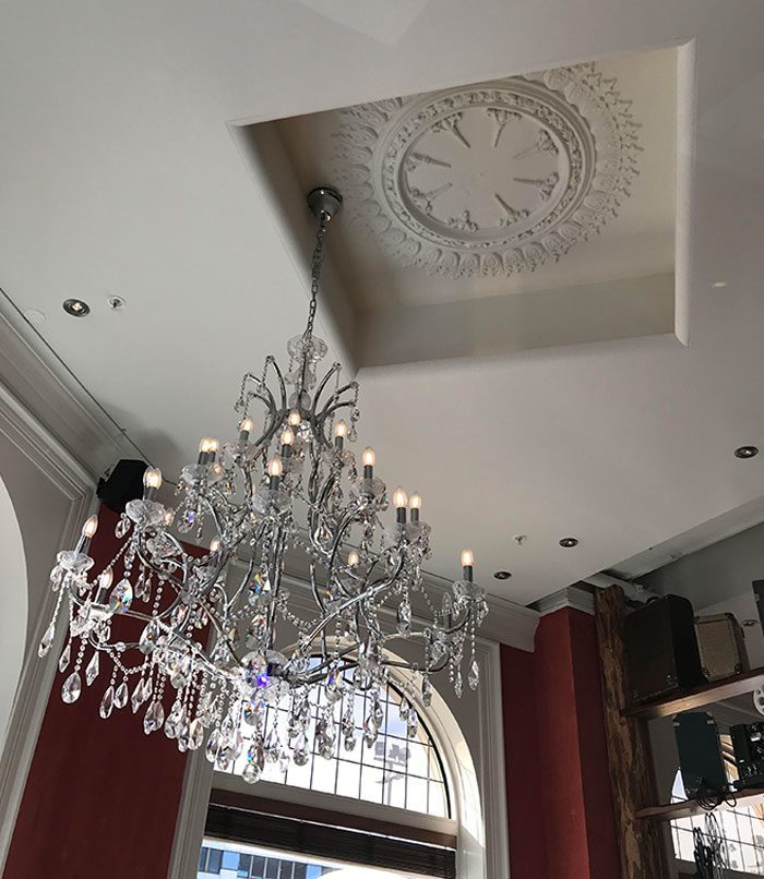
And so, they decided to put the chandelier on the side and allow that beautiful floral design to shine in its full glory. Who would have thought that the star would be sidelined by the supporting actor? We definitely did not!!
Neck Brace, Here We Come!
There are two bad designs fighting for our attention here. Let’s start with the odd table. It’s perfect for a divorced couple who take their kid to lunch but refuse to talk to each other. Just sit in the center chair and your back is naturally turned to the other person.
And we can’t ignore the lazy employee who hung up a sock photo the wrong way. They couldn’t even be bothered to rotate it 90 degrees. Instead, they left patrons with their heads tilted as they try to understand why the picture feels so off.
Dinner On the Orient Express?
The owner of this restaurant probably didn’t have a lot of space on their property to bring in as many people as he wanted. So he handed over his problem to the architect and boy, did the architect run with it.
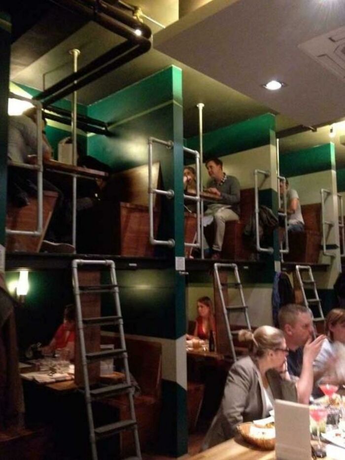
They converted the traditional dining seats into bunk bed tables, complete with simple ladders to reach the top “bunk.” Best of luck if you are wearing heels! Then again, it seems like the restaurant is doing well for themselves, so power to them!
A Bang-Up Job
Sign us up for this hotel. Not! We have all heard of the noisy people who keep disturbing their next room neighbors at night with their noisy antics. That’s guaranteed here as this bed placement is guaranteed to make noise when people sit up in bed.
Every time they want to sit up, BANG! The screams of pain won’t help with the noise level either. If you see a guest the next day with a big red bump on their head, you know why that is.
Mirror, Mirror On The Roof
Have you ever wanted to test your kink and have a mirror over your bed, like they show in the movies? Well, this designer had the same thought but must have decided that it would be too personal for some people’s tastes.
So, he put it over the public toilet stalls! Creative, huh? Now every time you pee or poop, your next stall neighbor or even the man outside can get it on that action, too. Better start charging money for that, buddy!
Alligator Detected
Are you scared of alligators in the water? Ever had nightmares that an alligator would jump out of a lake and eat you alive? This designer must have had the same dream because they included an alligator peeking up out of the floor in their plans.
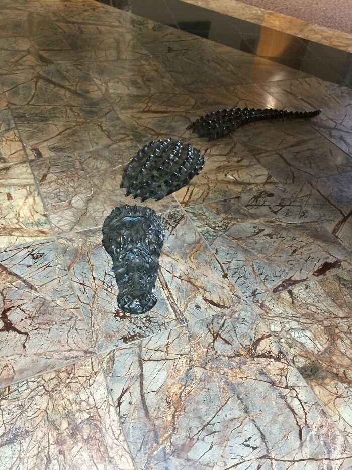
But, hmm, one problem with that. At first glance, it looks like a shoe print, which will trip you every time you walk over it. Secondly, we feel an alligator would look better on water rather than on land. Just sayin’!
Sharp Teeth Ahead
This is probably a dentist’s office, and the designer thought, “why not go with the theme and remind people exactly where they are? In case they forget, you know.” It’s cool and everything, but those seats sure look hella uncomfortable.
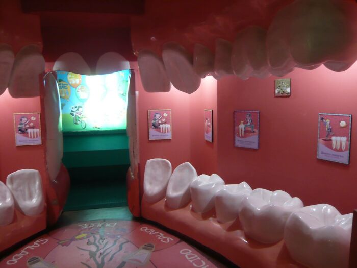
There is a reason why teeth are uniquely made to break down our food. The size, shape, and material are all perfectly designed to crush up our meals. And these seats look sturdy enough to break our hips… if we don’t slip out of them first, that is.
Slide Right Off
This is a unique one. The diner is probably in an earthquake-prone city and the designer probably thought, “Why wait for the place to shake and the roofs to fall off? I can do that myself, thank you very much!”
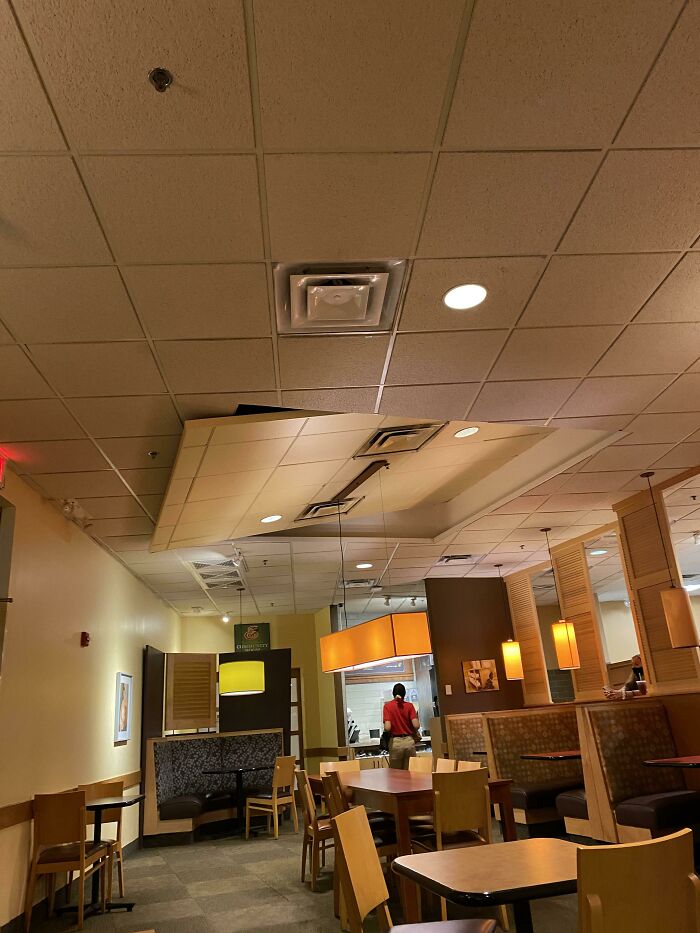
And thus, we were blessed with this random slanted roof in the middle. Honestly, it looks more like a fancy chimney than anything else. We’d hate to be the patrons placed right under that slanted section. Just be careful that you don’t choke as you rush through your meal.
Word Hunt
Five buck says this restaurant was designed by two different interior designers—one who wrote the quote and one who put the walls in the middle. But doesn’t the first guy know how to read? The quote was obviously written horizontally and not vertically.
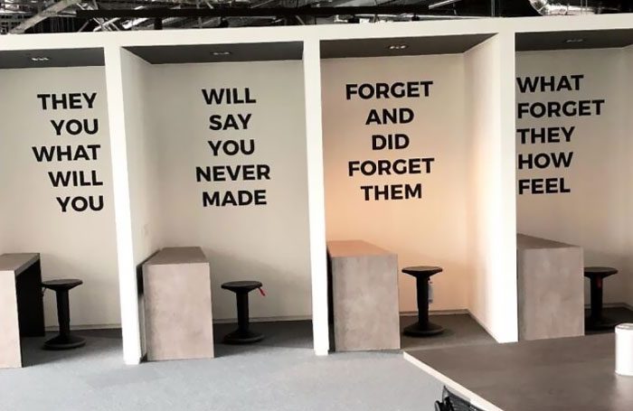
Well, we say “obviously,” but we’ll admit that it took us a solid 60 seconds to decipher this. Imagine trying to find a quiet place to study and learn English or improve your grammar, but are stuck with these partial quotes looming over you.
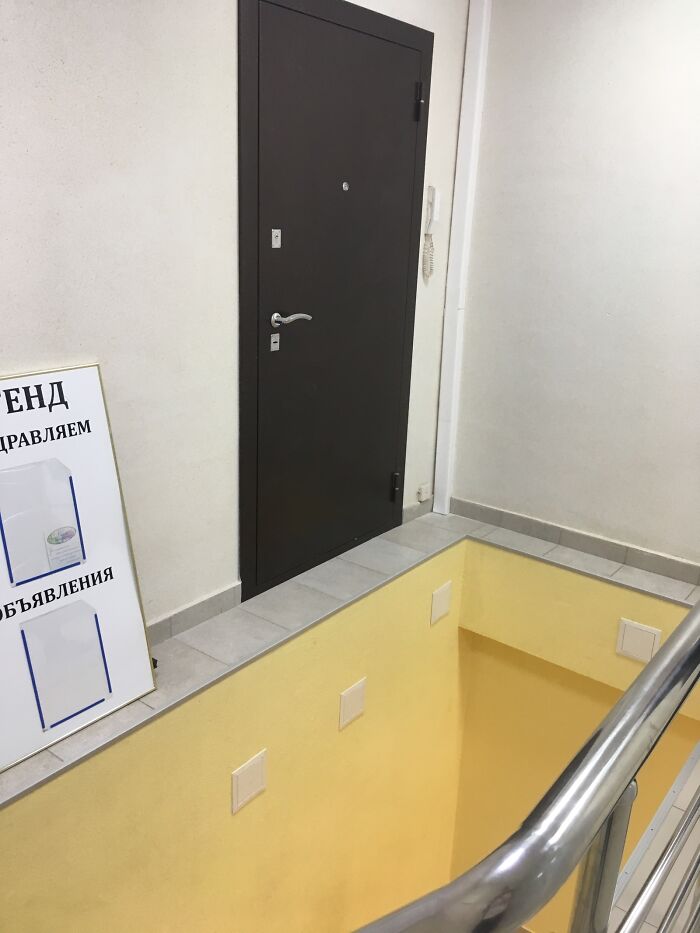
Pit Stop
This one is a joke. It has to be. We will not accept it otherwise. We might have believed you if you said it was just a quirky design, but the roll of toilet paper, water tank, and lifted seat tell a different story.
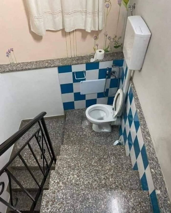
Surely nobody is actually putting a working toilet in the middle of a stairwell. Oh wait, unless the designer is the stupidest fellow in the whole world, that is. But even then, nobody would do something this idiotic, right? RIGHT?
Right-On You
This one just makes you wonder why the owners of other department stores don’t set up their Clearance Sales like this. Imagine the crowds that would climb on this pillar like monkeys. There’d be no crowds rushing in. They’d all be busy with the clothing pillar.
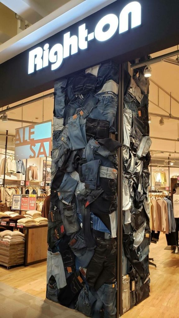
Jokes aside, this is probably the weirdest pillar design we’ve ever seen. Sure, it’s sort of appropriate for a clothing store, but the mosh pit of different jeans is just an eyesore. And we’d hate to think they ruined perfectly good jeans to create such a monstrosity.
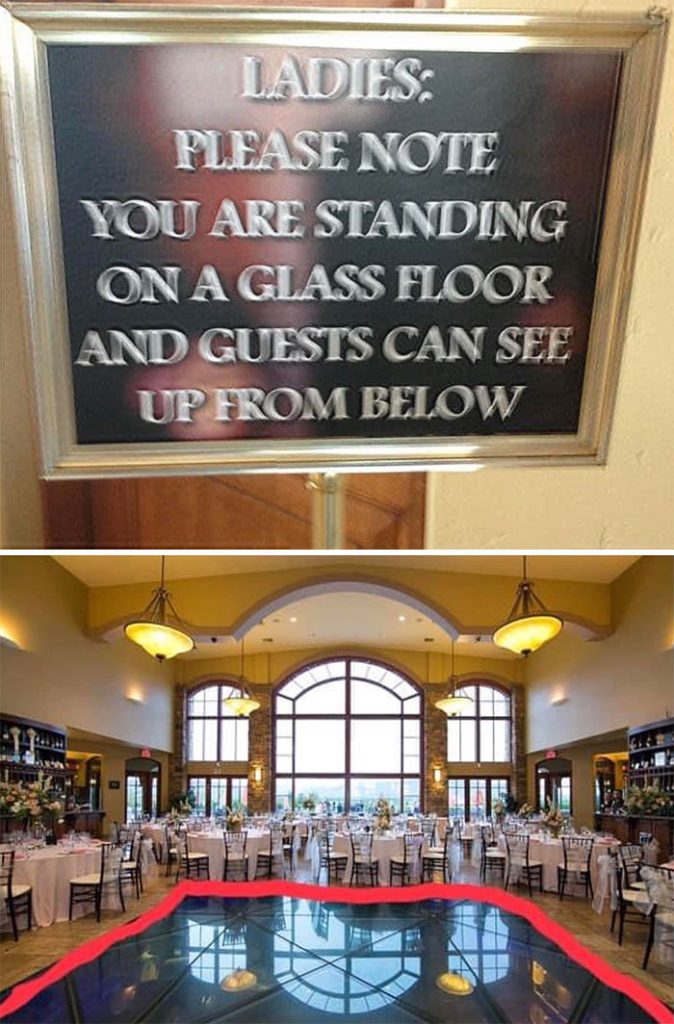
Best View Ever?
Now, this one is a view that no one says “no” to. Not that they say yes, either. It’s because you need to be conscious in order to refuse this gem, and we’re pretty sure one look at this will make anyone pass out.
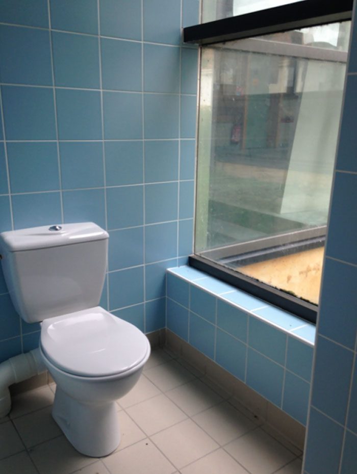
The designer probably thought that looking at the four walls of a closed bathroom might be a bit claustrophobic for some people, so he decided to give them a view! Best of luck to the person who walks in that corner to light up a cigarette; you have a surprise waiting for you!
Jump Right Off
This designer was in a mood we can all relate to. They know exactly how it feels when we walk into work every Monday. This one is for anyone who wants to call in sick just to skip another dull day of work.
With this door, it’s pretty easy, actually. Open the door and fall right out. A little back pain and a little bump on the head will do the trick. And don’t even try to cover the floor with plexiglass. The vertigo is enough to make people sick.
Disco Racks?
Ever wonder what a dancing coat hanger would look like? Well, we’re here to satisfy your curiosity. This one looks like the Tin Man from the Wizard of Oz or the Cyberman from Doctor Who. Or, if you want an example closer to home, it looks like a fancy shower handle.
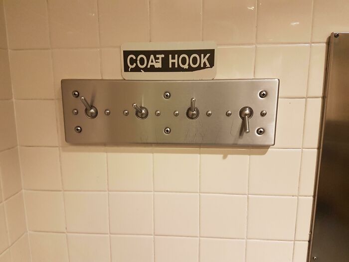
Guess what it doesn’t look like? A coat hook! The designer seriously needs to look through a few catalogs to see what they actually look like and how they function. Or, worse, they need to work on making sturdier pegs that won’t flop down.
Open More Than You Need
We’re at a loss here. Either someone was trying to be clever, or they were way too lazy to check their work before printing and pasting it on the wall. This store is taking customer service too far by making two extra days in the week to serve their patrons.
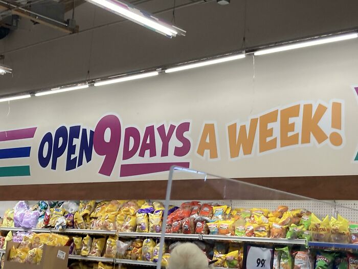
We hope you don’t take your kids here. Otherwise, they might get confused and start questioning every less you and their teachers taught them. “Aren’t there seven days in a week? What else are you wrong about?” Oh, we can hear the endless questions now.
A Little to the Right
Here we go again with the “nightmare for perfectionists slideshow.” The designer here probably thought that a star should always shine alone and must always be the center of attention. While this isn’t a new concept, it’s not exactly applicable to every scenario.
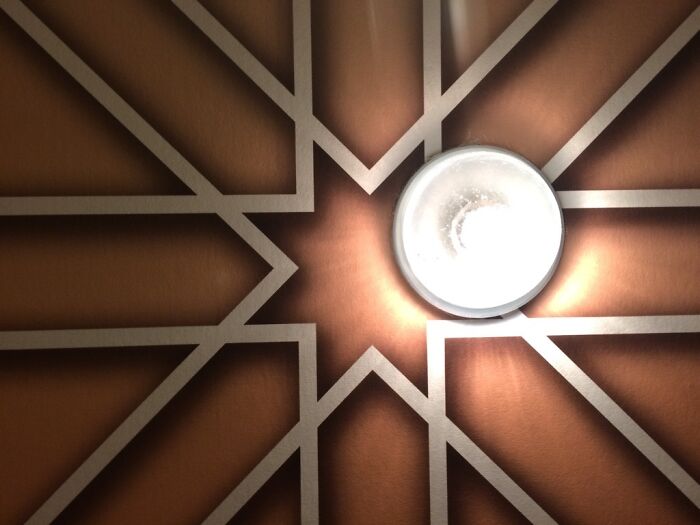
Movie stars? Sure. Star Christmas tree toppers? Absolutely? A light fixture in a geometrically-designed ceiling? Yeah, not so much. Why are these designers so full of themselves that they make life harder for everyone else simply to admire their own work?
Instagram, We Came First
Have you seen those Instagram reels recently where people try to see how symmetrical their face is? Or how they would look if their left side was also their right side and vise versa? Well, guess who did it first…
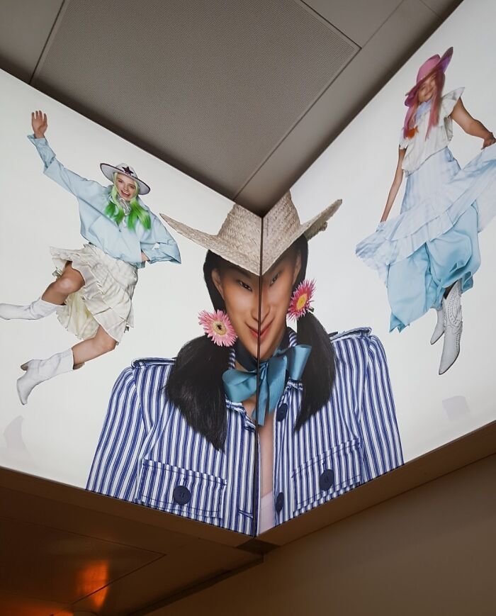
This guy right here! Thank god the model has a perfectly symmetrical face. Otherwise, if we were her, we would probably sue them till the end of time. Then again, that distorted Joker-like smile isn’t exactly a good look on her.
No Space to Shine
Who came first? The wall or the light? Either the designer first made the wall without taking into account how big the light would be, or he wanted to kill two birds with a stone and put the light in the middle so he wouldn’t have to buy two lights separately for each room.
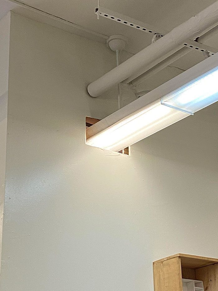
The idea isn’t bad, but imagine if someone in one room wants the light and their neighbor doesn’t. Who gets custody of the light? And who takes the room which has the switch? We would rather spend a little more money and purchase two lights.
Fan Us Away
Class can be pretty dull, especially on a hot summer day. With the lights dimmed, the projector on, and the cloying heat, it’s easy to fall asleep. And in this classroom, you can’t have your lecture and cool down, too. The moment you switch on the fan, bye-bye projector.
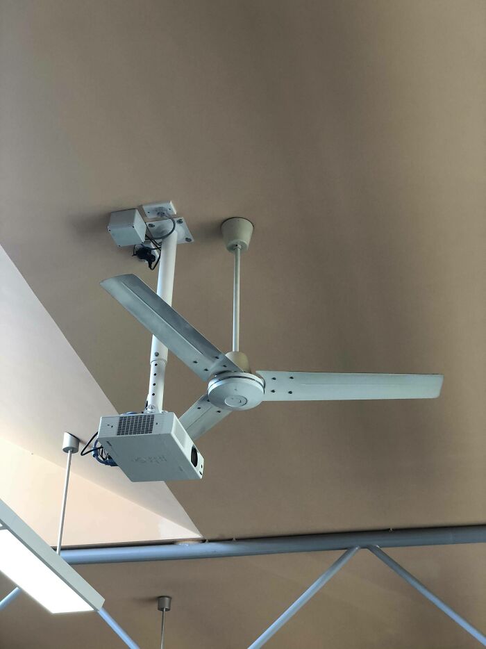
Maybe the projector could show a presentation of “The Stupidest Public Place Design Ever,” and this picture could be the first slide. But anywho, this choice seems tragic. Do you wanna feel the wind or watch whatever film the teacher has queued up?
Patch Job
We don’t know what this designer was trying to do. Did they want to direct everyone who came out of the elevator to the boss’ room, or were they trying to save the yellow carpet by patching together whatever fabric they had, regardless of the color?
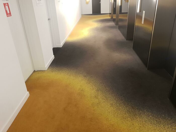
All we know is this carpet looks like it hasn’t been washed for a hundred years. Or perhaps there was a messy spill of bleach that no one bothered to deal with. Or perhaps it got burnt in a fire. Can we burn it in a fire? No? Okay.
Van Gogh, Is That You?
For a second, we thought this was a painting. It took us a minute to realize that this is actually a mirror, and the warped face is someone is trying to take a mirror selfie. Then again, this might actually be a genius design…
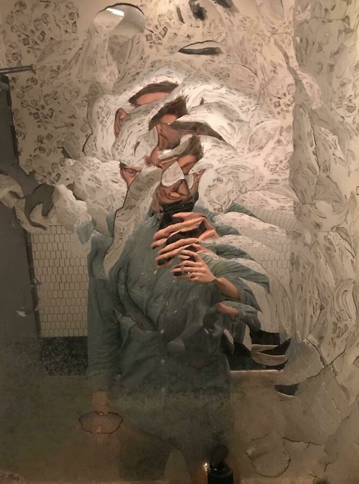
They probably know all about filters and wanted to save everyone some time and add a built-in filter for anyone eager to take a mirror selfie. But if you want to use a mirror for its actual purpose, then you’re out of luck, friend.
The Game of Thrones
This one is a mind twister. The hotel owners wanted the people here to have a little fun and gave them a challenge as to how they could reach that tiny sitting area. Let us tell you the answer—unless you are a monkey, you cannot.
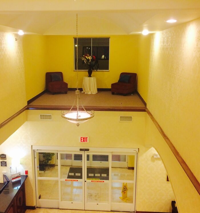
This area has no stairs, and no way where you can reach this place. Or, and hear us out, maybe it is a sitting area for the resident ghost. Because the other way you can reach there is if you float. There you go, mystery solved!
Hurt Me When You Leave
This thing is an injury waiting to happen. Imagine you are in a hurry and racing to the next room. You sprint to cross the threshold, and before you know it, your waist is in excruciating pain as you hit yourself on this wooden block.
This one is also a sue-worthy object that is going to earn the customers a lot of money. The owners should just start giving money away at this point. This is the ultimate dilemma: do you meet accessibility rules or let logic take the wheel?
Can You See You?
Designers and their toilets. We have had too many in this article alone, and the theme is always the same: you have a direct hotline to someone peeing in their cubicle. Is this one different? No; no it is not.
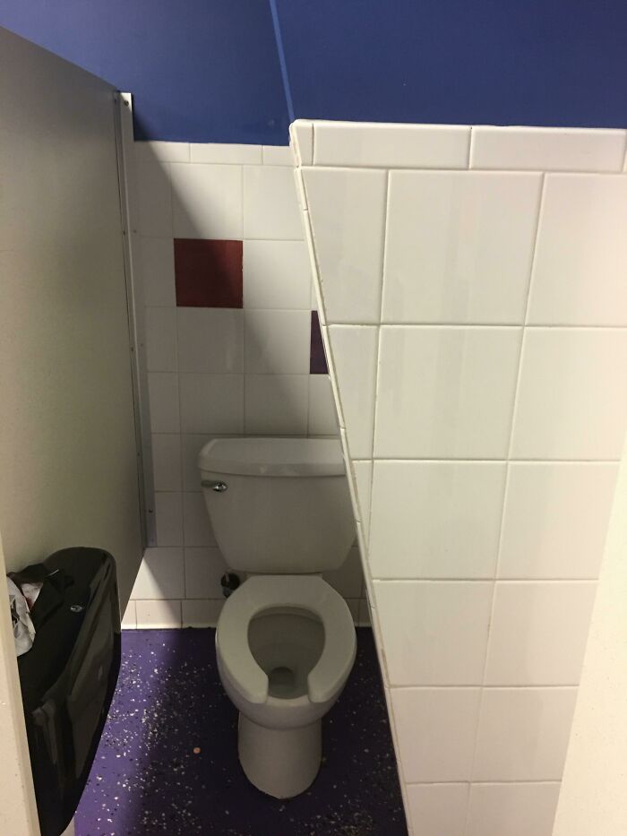
The designer probably had a shortage of tiles and cement because he made the wall halfway through and left it in a way that doesn’t allow for a door. Open floor plans might be all the rage, but open door toilets will never catch on.
Dots, Dots Everywhere
We bet you can’t look at this carpet for ten seconds before it messes with your head. This polka dot carpet is so confusing that your eyes would hurt or you’ll get vertigo if you look at it for too long. And best of luck if you lose something in here.
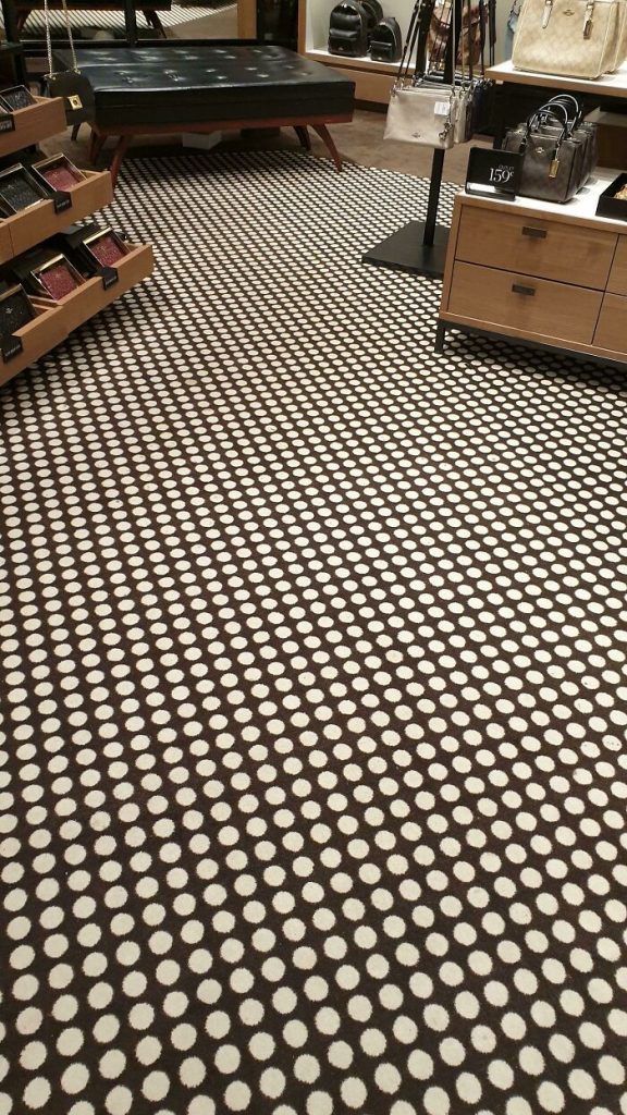
We are pretty sure it would take you and ten other people to find it in this amusement park of a room. That area must be where the store puts its most expensive products as thieves would have a hard time being sneaky there.
Meet Cute
What is the cutest date that you can imagine? A walk on the beach? A coffee date? Movie date? A carousel ride? We have a better one for you. This restroom where the two toilets face each other and are placed just far enough to let your legs brush against one another.
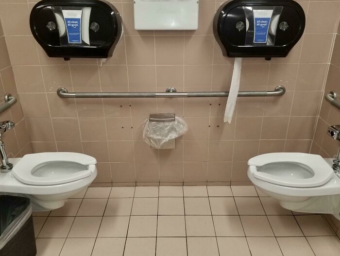
After a lovely dinner, both of you can come here and talk your worries away. You can clear your thoughts and your bowels at the same time. This would be a good place to meet someone for the first time as well. They would already have their clothes off!
Orange Milk
Here we go confusing kids again at the grocery store. Not only have the owner of this grocery put juices under the signboard promoting milk, but even the milk on the board isn’t what it should be. It’s orange juice… right?
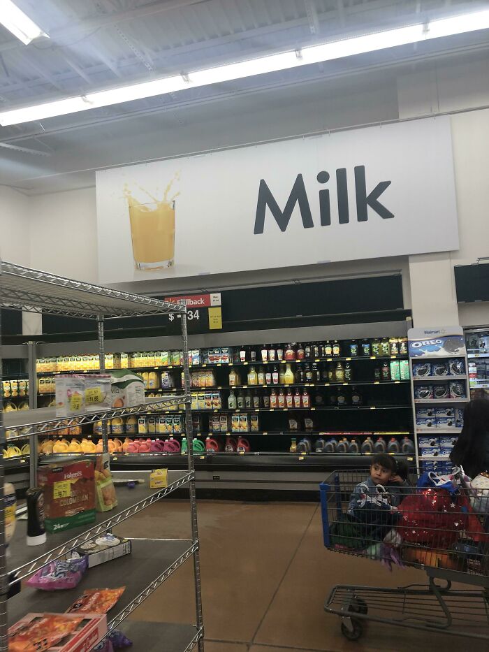
Your five-year-old toddler is going to be really confused when they see the milk they get at home is so different than the one that is being promoted here. We can see a tantrum right there in the juice aisle in the near future.
Take My Face Away
It is all about the placement, we say. This poster of a beautiful woman was placed on the wall in such a way that the door is fitted right where her eyes should be. Every time someone opens the door, her eyes are removed from her body.
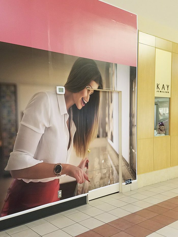
In a really, really scary way, no less. This wall is the type of nightmare fuel that horror movies are made of. We really hope the model in the picture never walks into this mall ever. Does this shoddy design count as defamation?
Lemme Smell Your Food
What happens when you give a touch screen to a technology-averse adult and ask them to zoom in? This happens. Whoever approved the wall pattern must have really liked the model’s nose. We can’t think of another reason for this gigantic beast.
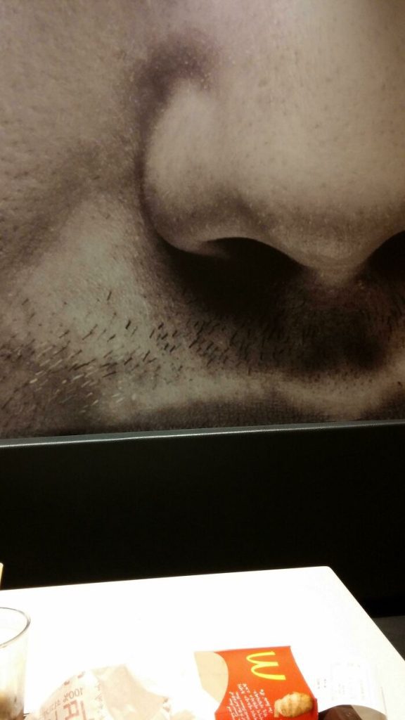
Hey, but look at the bright side, it is like having your own personal “food smeller.” If he catches a whiff of something off, he’ll warn you before you take a bite. We just hope that the hair on his beard doesn’t fall on your food, though. That would be gross.
End of the Road
The owner wasted so much money on the stairs and then realized that there was nowhere to go. So, what did he have the architect do? Make the staircase anyway. Because, as they say, you should always make your dreams come true.
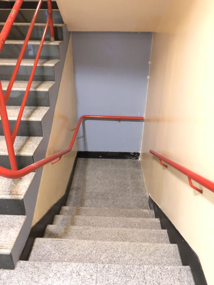
And this staircase would be really handy for murderers in a thriller movie. If they make it down the flight of stairs without tripping they’ll find themselves stuck between a rock and a hard place. Where will your victims run away? Nowhere; absolutely, nowhere.
In The Middle of The Sea
Ever wanted to visit those underwater aquariums that everyone keeps talking about? Well, they might be a bit expensive for you but worry not. This designer is here to make all your wishes come true. They designed this washroom so that it feels like you are in the middle of the ocean.
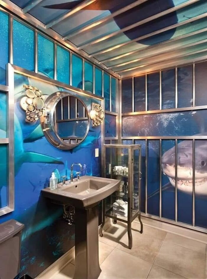
You look up, and there’s a deadly shark. You look to the right, and there’s a deadly shark! However, we’d just like to think of it as a fishy friend keeping us company as we dutifully wash our hands after using the bathroom.
Purpose, We Ask You
What is it with malls and fountains? The building should be visually appealing enough that you don’t need to add a high-maintenance work of art with a serious splash zone. Though, looking at this fountain, we have a new appreciation for the giant, out-of-reach ones other malls have.
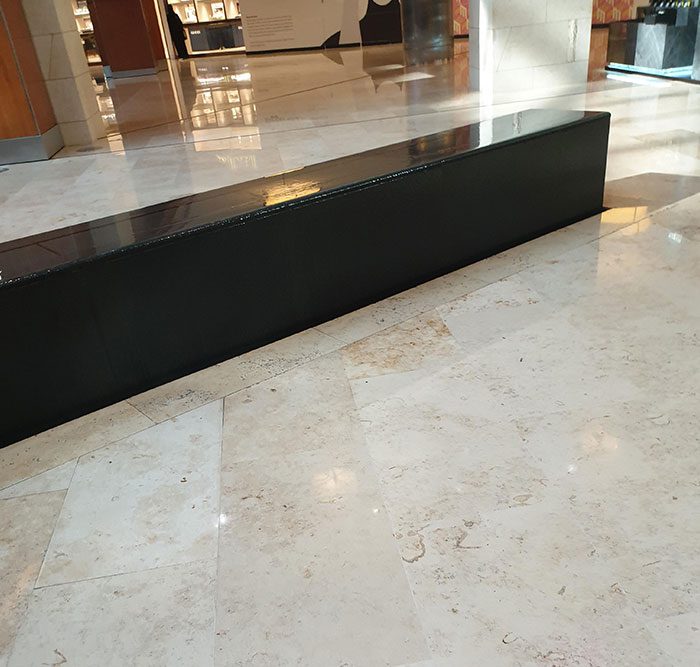
We can’t even imagine how many poor souls mistook this black block for a bench. Any parents that turn their backs are almost guaranteed to find their kid slipping and sliding on the oddly-placed structure. Once again, this is just a lawsuit waiting to happen!